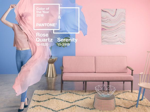
There is a first time for everything! Pantone just announced not one but two shades, Rose Quartz & Serenity, as the 2016 Color of the Year. This harmonious duo came as a happy surprise. It is not like anyone expected the pairing of two opposites, a warm dusty pink and a cool blue.
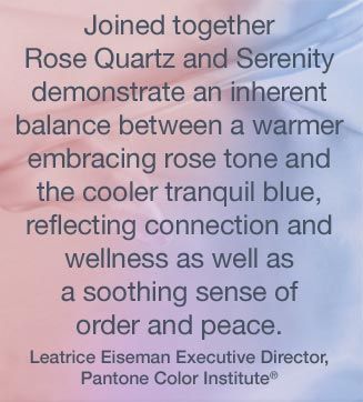
The inspiration came from the ever changing and chaotic times that we now live in; consumers seek harmony and mindfulness which can be found in color.
Rose Quartz (Pantone 13-1520) is a “persuasive yet gentle tone that conveys compassion and a sense of composure.”
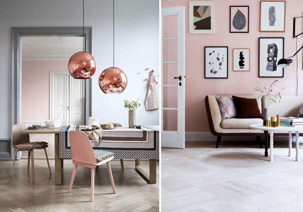
Serenity (Pantone 15-3919) is “weightless and airy, like the expanse of the blue sky above us, bringing feelings of respite and relaxation even in turbulent times.”
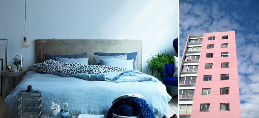
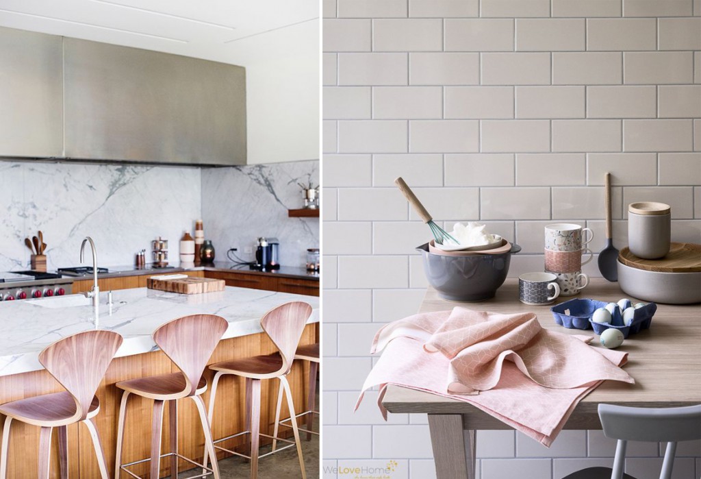
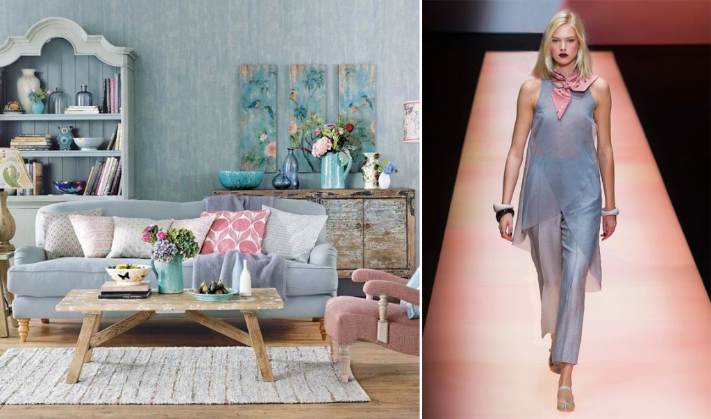
Expect to see this harmonious duo across high fashion, home interiors, accessories and design throughout the year. Independently or coupled together, Rose Quarts & Serenity will bring a sense of calmness and relaxation to any home environment.