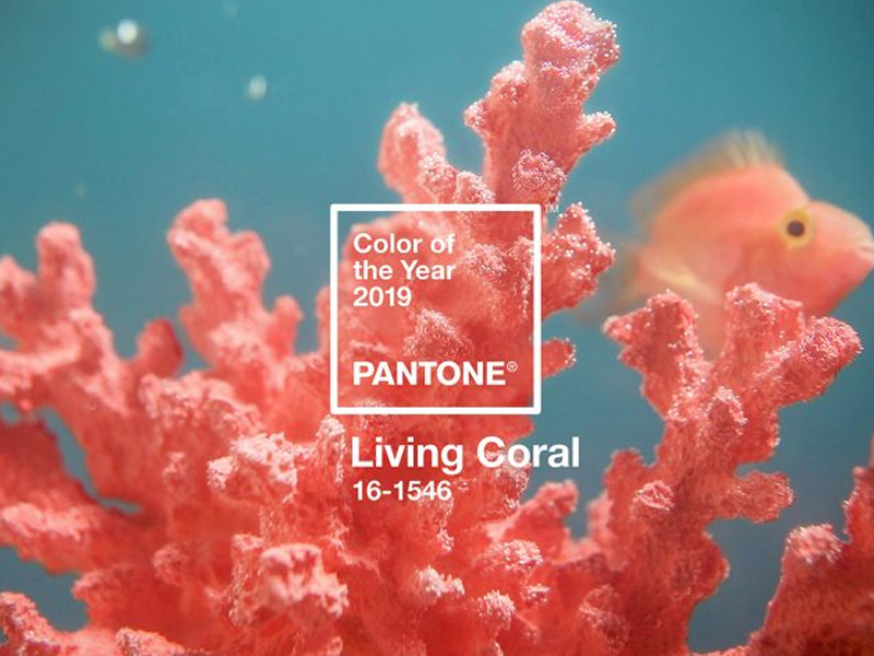
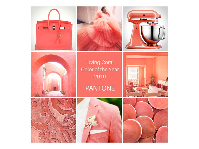
Living Coral aka Pantone 16-1546, has been named the 2019 Color of the Year. This vibrant shade is said to dominate the design industry over the next 12 months.
2018 was definitely ultra violet. The provocative, thoughtful yet mysterious shade of purple led us straight into the calmness and comfort of Living Coral. Living Coral embraces us with warmth and nourishment to provide comfort and buoyancy in the Read More 2019 Motto: Living Coral
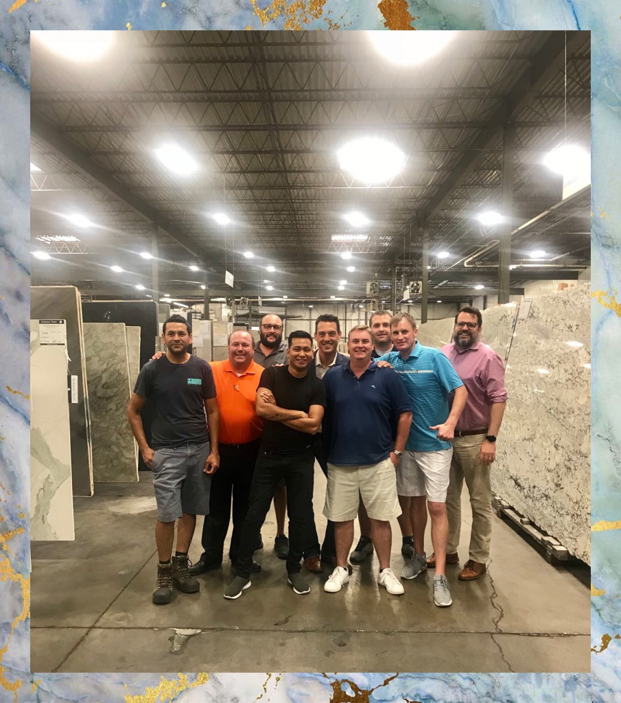
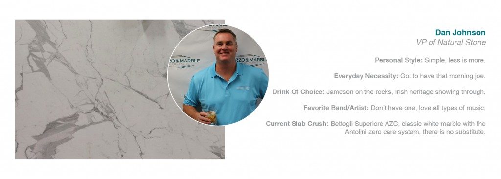
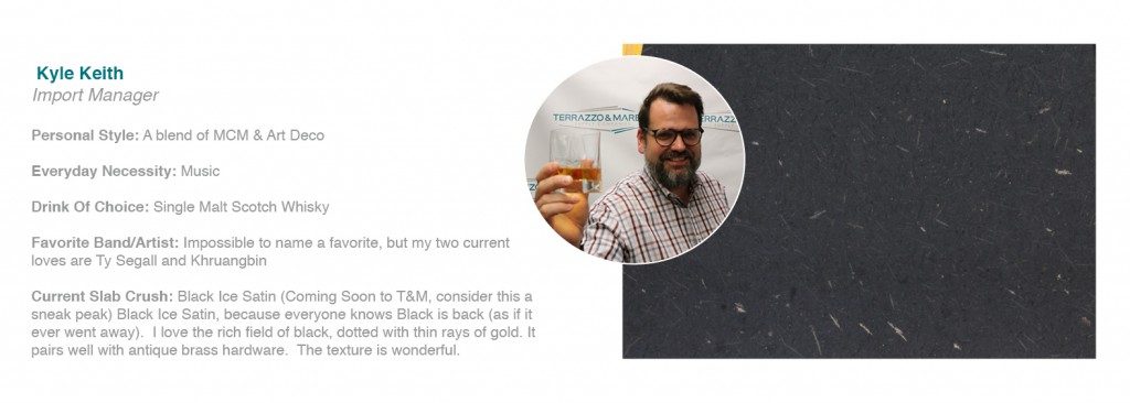
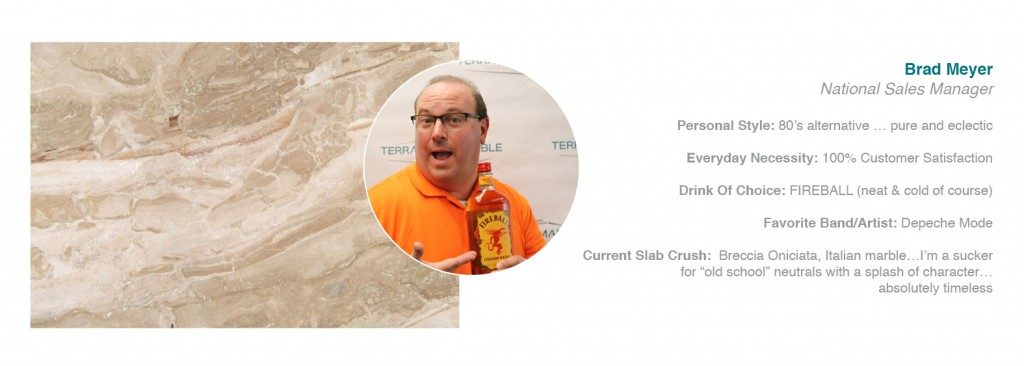
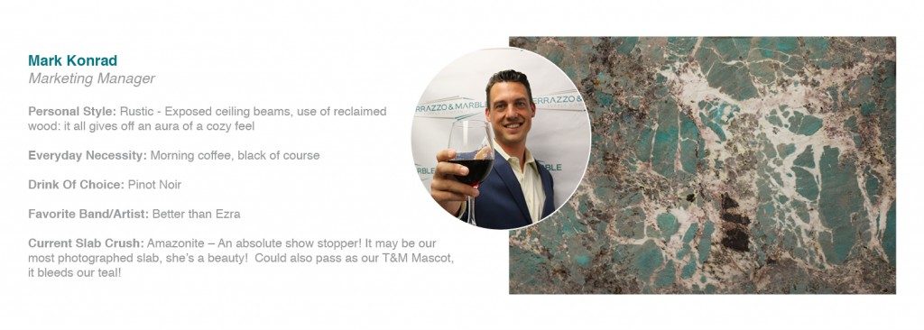
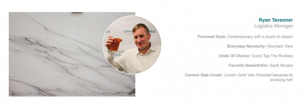
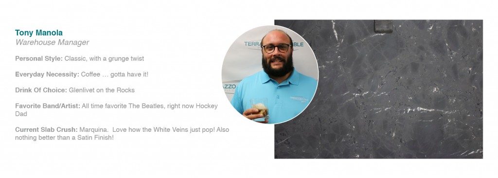
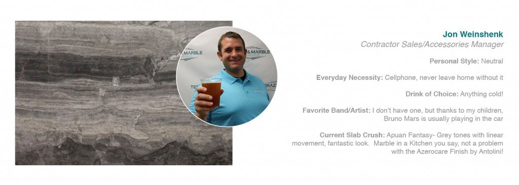
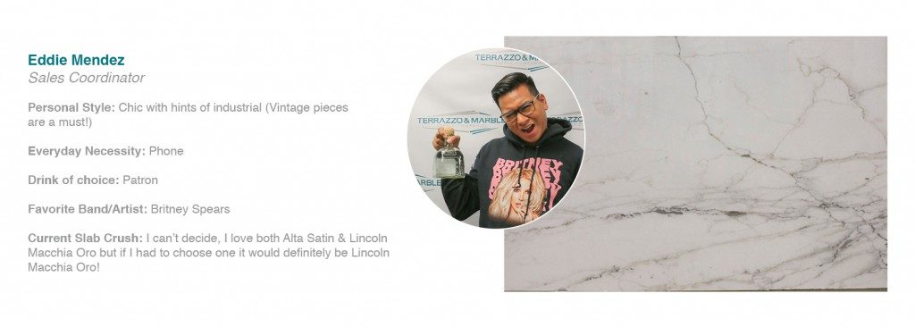
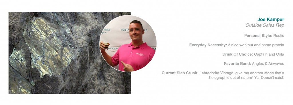
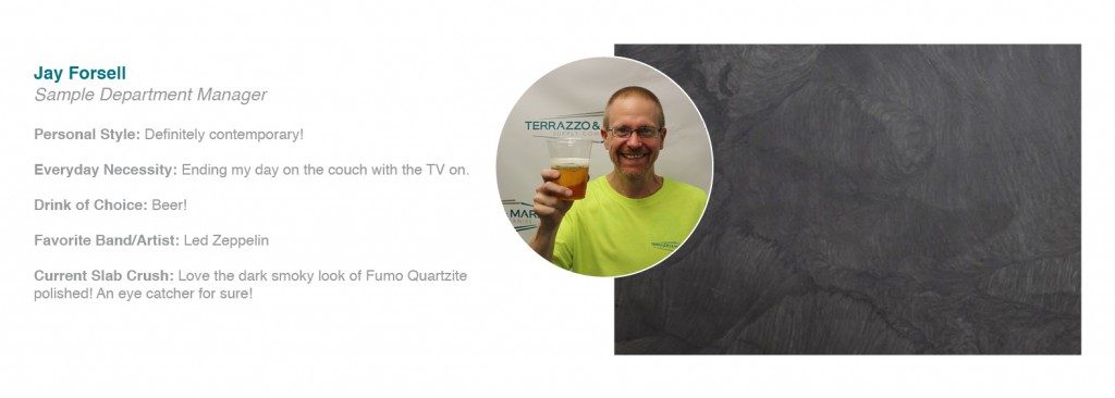
It’s getting hot in here! The men of T&M highlight their go-to drink, favorite band and current slab obsessions! If for a second there you thought that men don’t care about design or don’t have an opinion about decorating and their favorite pieces, then you were wrong – most men do!
So ladies, and gents, sit back and get to know the men of T&M!
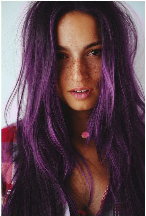
Who saw this coming? Pantone just announced Ultra Violet as the 2018 Color of the Year. 2017 was all about Greenary, the color of new beginnings & growth. As we step into 2018, it’s the year of mystery, the unknown, the what’s to come. Ultra Violet is a dramatic, provocative and thoughtful shade of purple; “it communicates originality, ingenuity and visionary thinking that points us toward the future.’ -Pantone
“We are living in a time that requires inventiveness and imagination. It is this kind of creative inspiration that is indigenous to Ultra Violet, a blue-based purple that takes our awareness and potential to a higher level,” said Leatrice Eiseman, Executive Director of the Pantone Color Institute. Ultra Violet is the perfect example of what the world needs. Stop worrying, stop debating. Channel your inner 5 year old self, and get lost in the power of your imagination, get creative and explore the all the possibilities that 2018 has to offer.
Different shades of purple have always made a strong impact in design and décor but now more than ever you will notice Ultra Violet popping up anywhere and everywhere. “As individuals around the world become more fascinated with this color and realize its ability to convey deep messages and meanings, designers and brands should feel empowered to use this color to inspire and influence.”
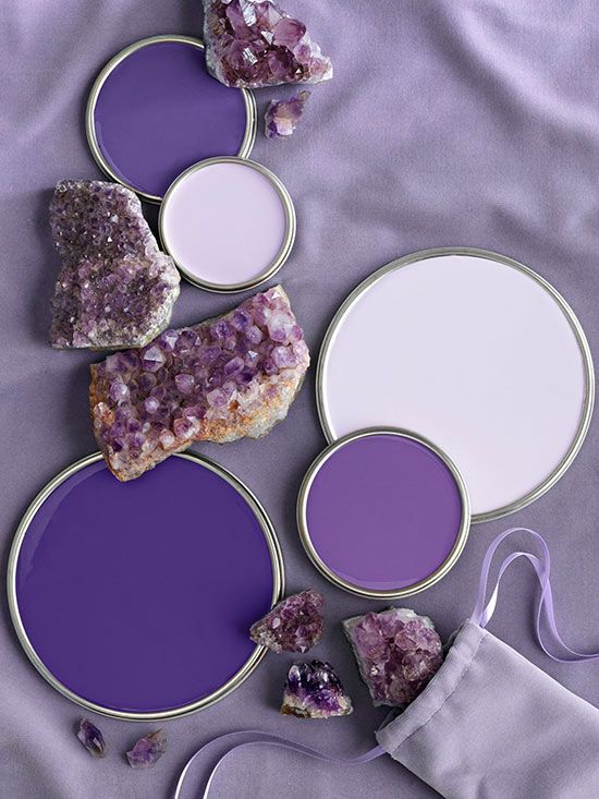
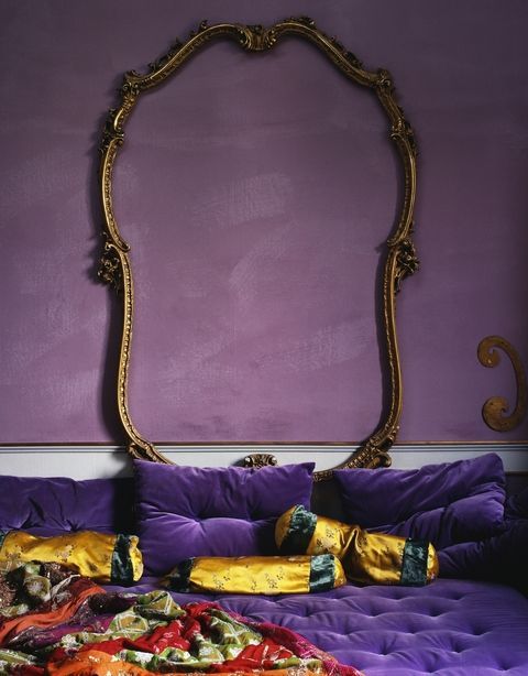
Decorating with Ultra Violet
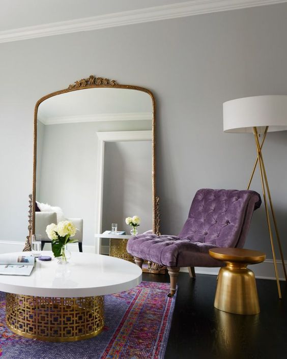
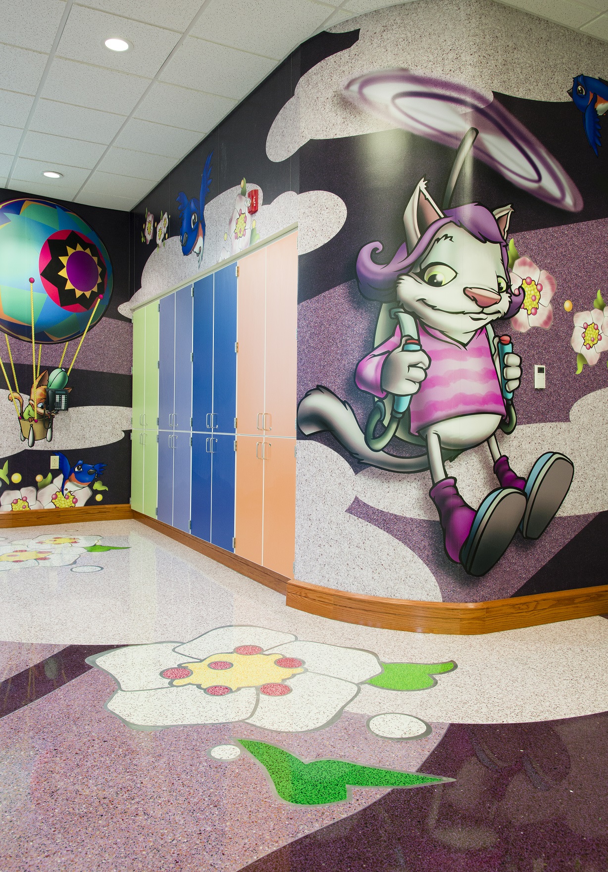
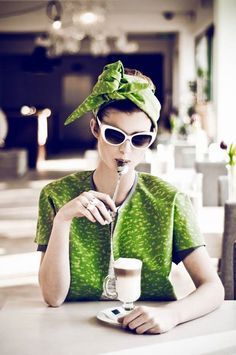
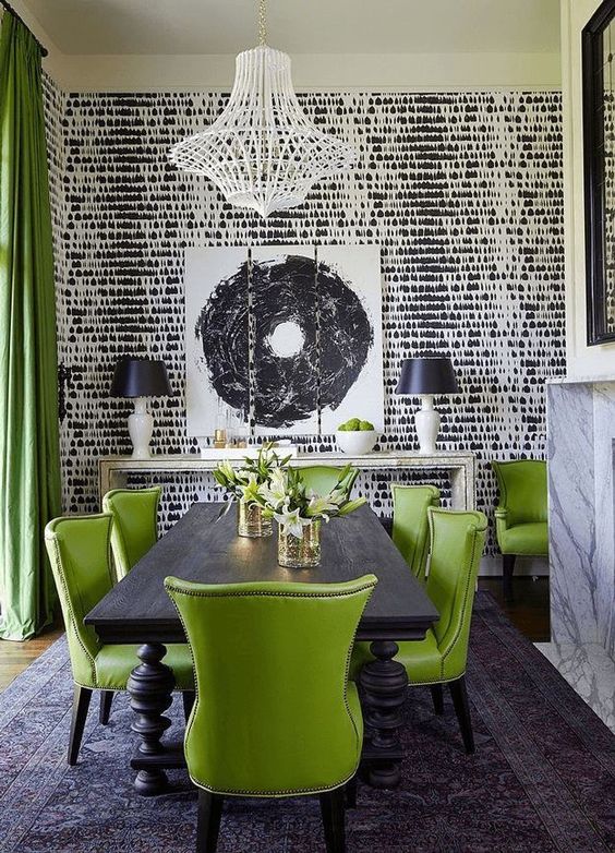
It’s easy to make a bold statement in any space by incorporating Ultra Violet. Something’s very edgy and electrifying about this color. Think dark and romantic, leather, velvet – wow are your creative juices spinning yet? Go big or go home, right?
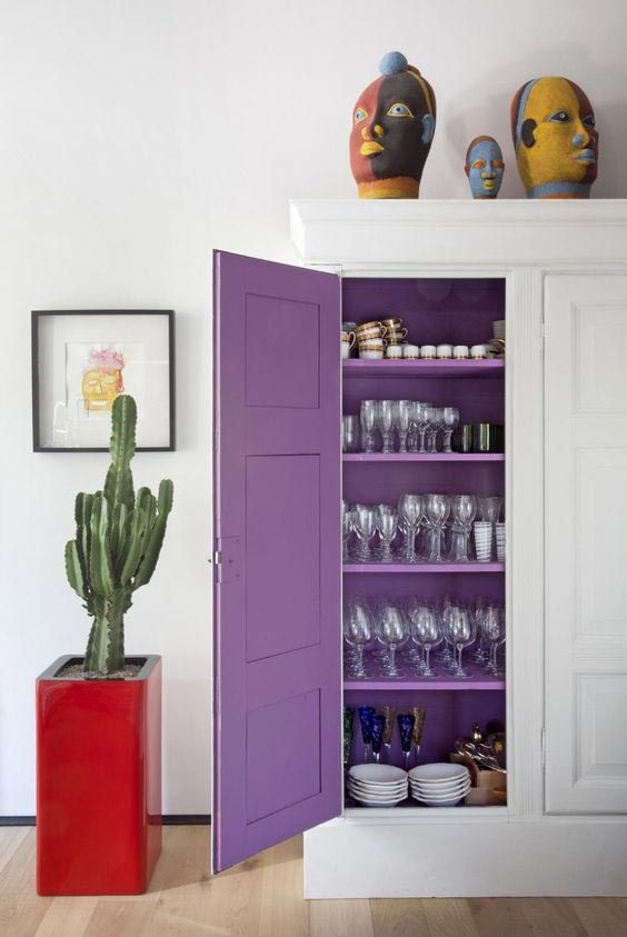
On the other hand, Ultra Violet can be subtle too. It’s an easy color to work with; it’s both a warm and cool tone, very versatile when it comes to décor. It’s a great accent color, think wall color, striking purple couch, statement pillows and so on.
Ultra Violet in any Space
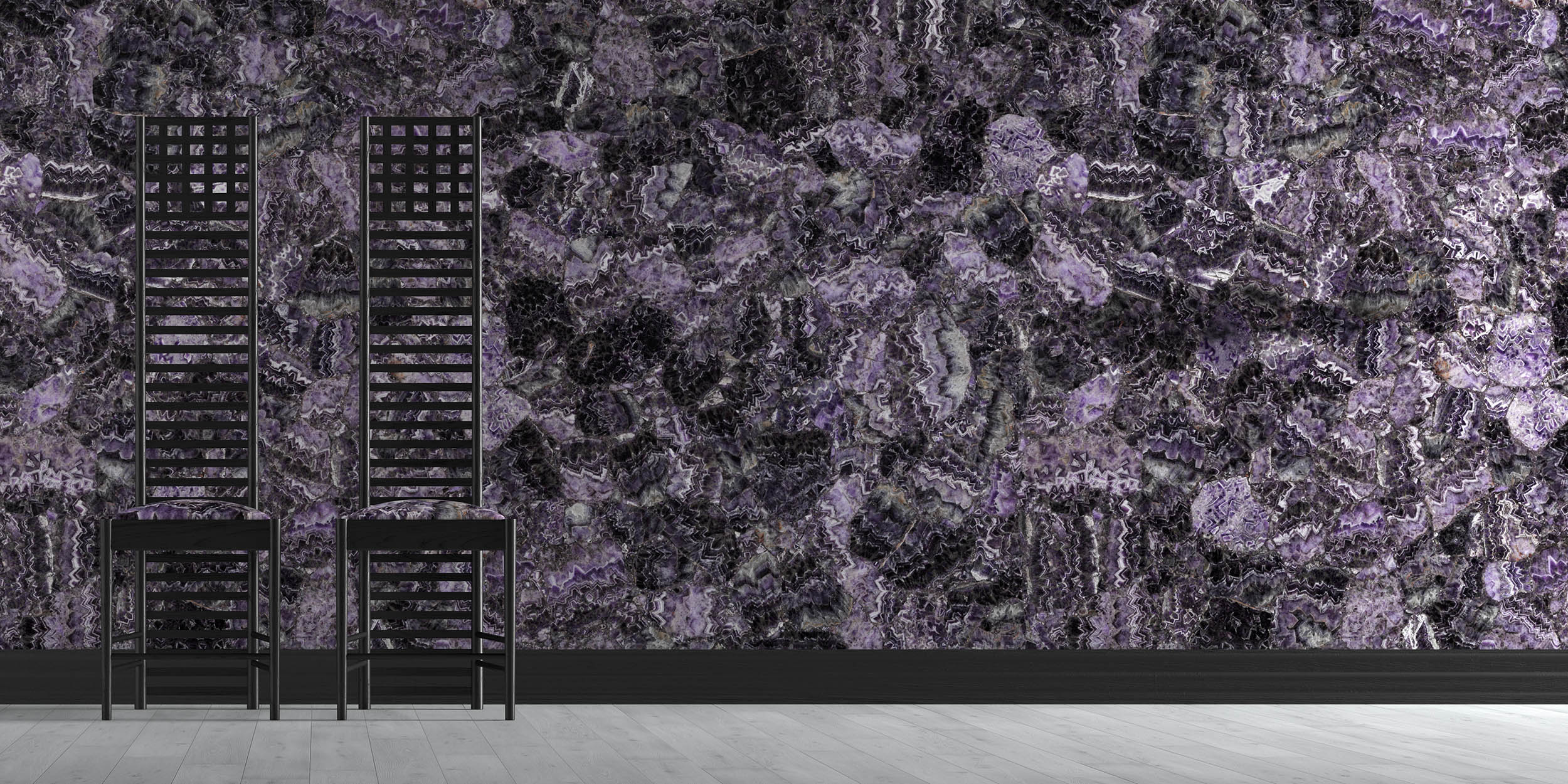
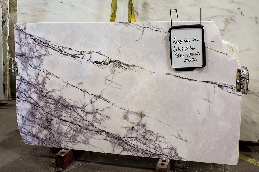
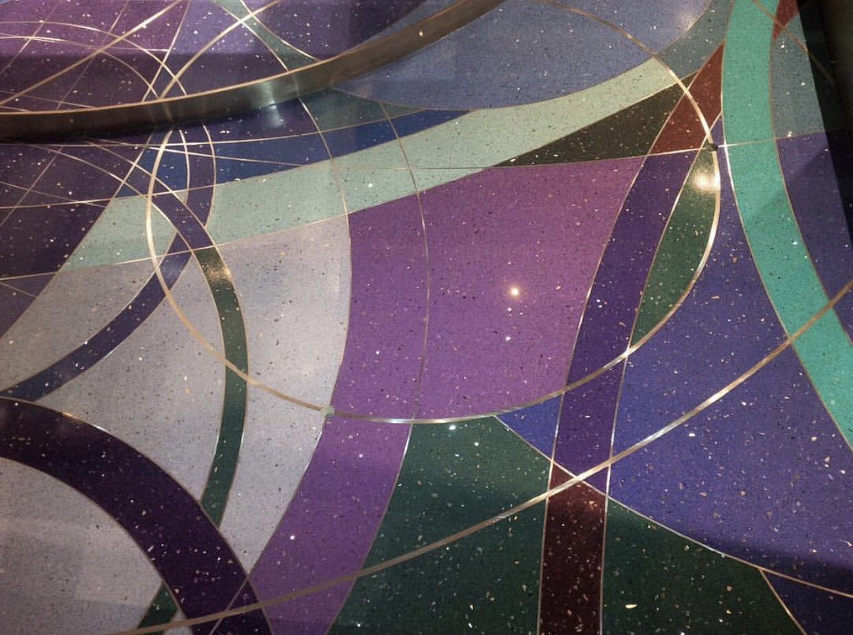
Ultra Violet is a great statement color that can easily be incorporated into any space, both residential & business. Think Amethyst Precious Stone as a backsplash or a striking White Marble with intense violet veining like Greylac.
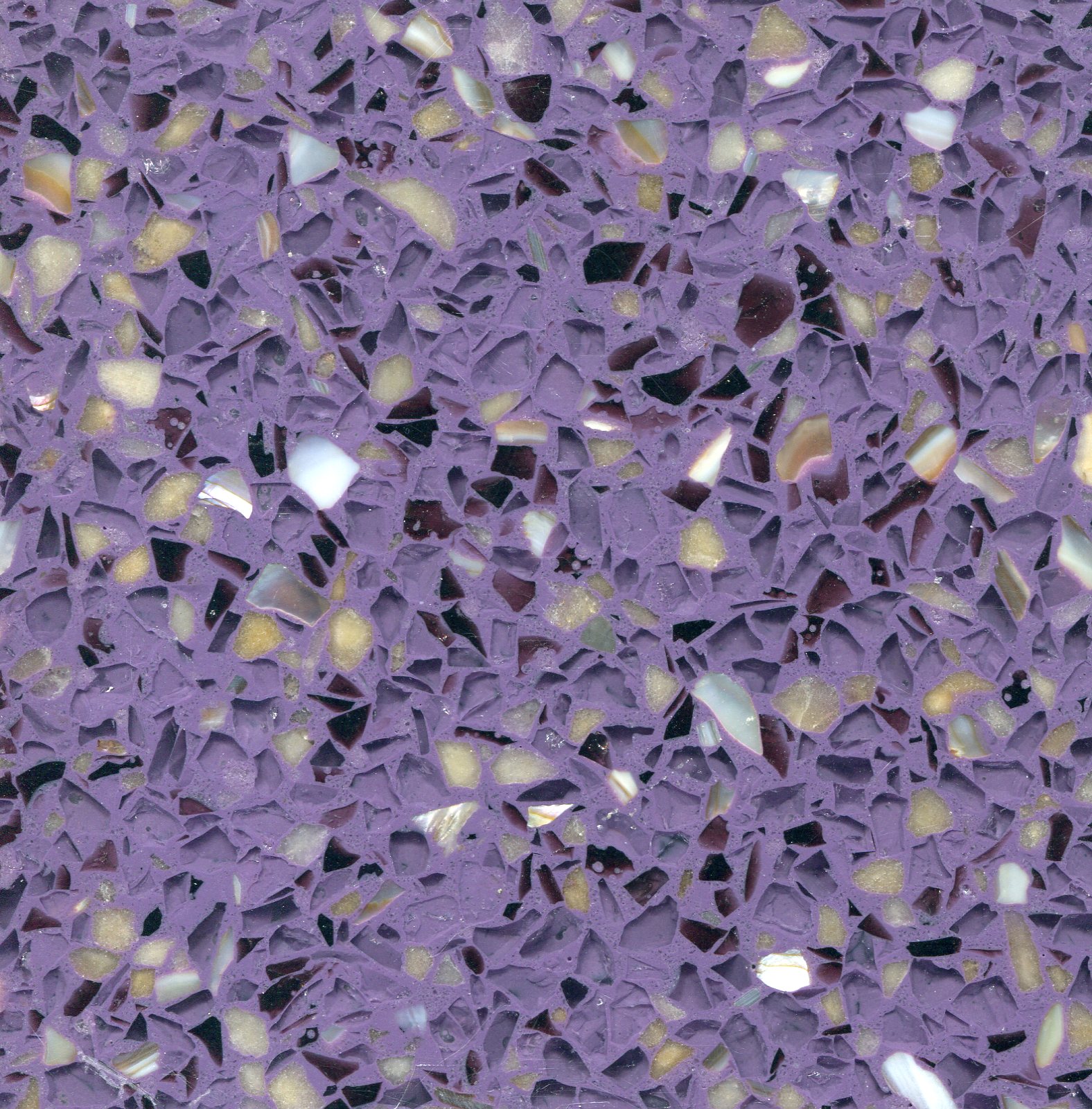
Pinterest top 100 trends to try in 2018 recently came out and Terrazzo was among the list. Up 316% on the saves, Terrazzo is bigger then ever. With endless design and color options that are available for terrazzo, why not incorporate this savvy purple shade.
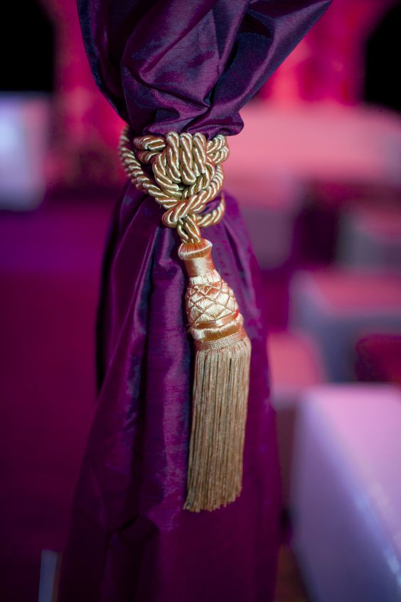
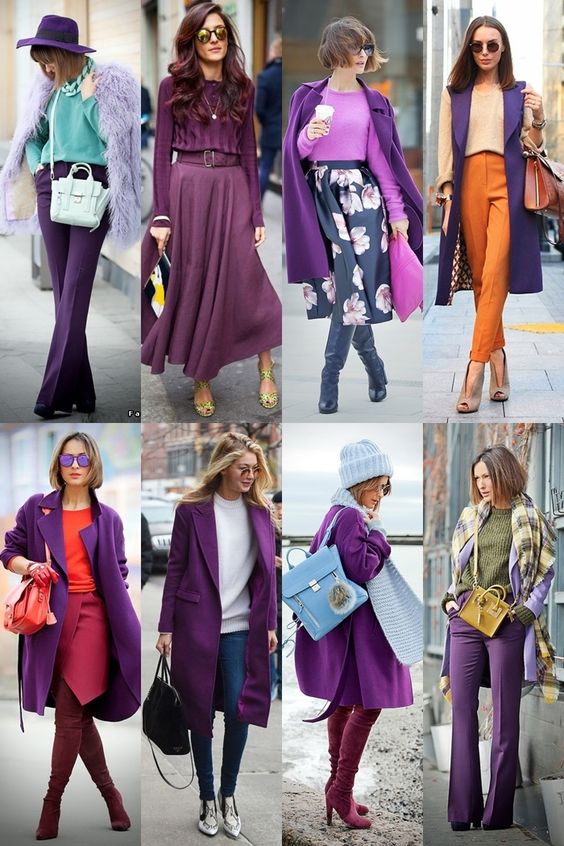
Wearing Ultra Violet
The enchanting purple is quickly making its way to the runways and the streets. Ultra Violet becomes luxurious when paired with golds and metals. While paired with greens and neutrals it evokes elegance.
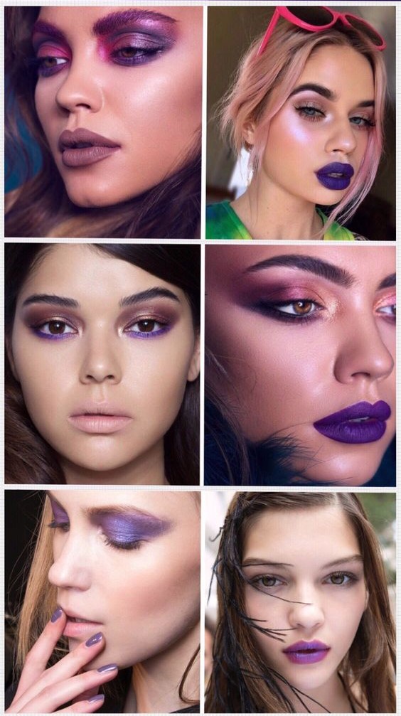
Ultra Violet is quickly becoming the it color in beauty. Purple shades in hair continue to elevate street styles as a symbol of creative expression. A touch of purple on the lip or lid is a sign of confidence, not an everyday look that’s for sure.
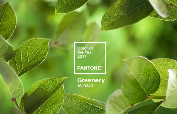
Every year, Pantone chooses a color that reflects the current cultural climate and serves as an expression of a mood and/or attitude. 2016 was the year of Rose Quartz & Serenity, the inspiration behind this duo came from the ever changing and chaotic times where consumers were seeking harmony and mindfulness which was found in these two calming pastel colors. We were happy to hear that Pantone unveiled the 2017 “Color of the Year” to be: Greenery. Greenery signifies new beginnings & growth! 2017 let’s do this!
“Greenery burst forth in 2017 to provide us with the reassurance we yearn for amid a tumultuous social and political environment. Satisfying our growing desire to rejuvenate and revitalize, Greenery symbolizes the reconnection we seek with nature, one another and a larger purpose.”
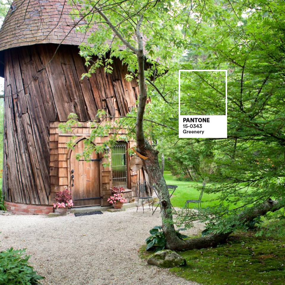
Greenery is nature’s neutral! In a world taken over by technology, Pantone has partnered with Airbnb to create an experience in nature inspired by Greenary! “There’s a growing desire to reconnect with nature and what is real, and find ways to disconnect from technology. We need a break. We need to stop and breathe.” -Laurie Pressman, Pantone Color Institutes VP. Disconnecting with the world and connecting with oneself can bring joy, peace and the ability to view life on a more positive note.
On top of it all, Pantone did our homework for us by creating a selection of 10 palettes pairing Greenery: http://bit.ly/2gE4JEE. This versatile, “trans-seasonal” shade that can be seamlessly paired with a variety of different neutrals, brights, pastels, metallic and even the two 2016 colors of the year, Rose Quartz & Serenity.
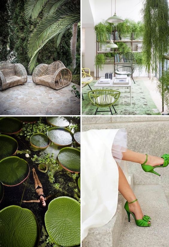
We are excited to find this zesty yellow-green shade in fashion, decor, architecture and more throughout 2017!
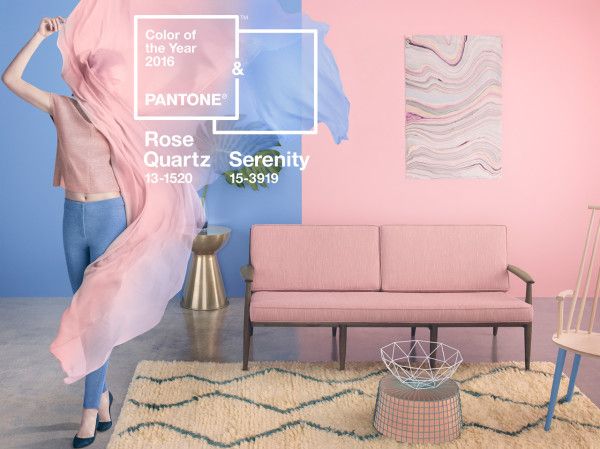
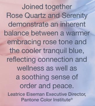
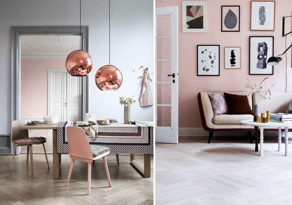
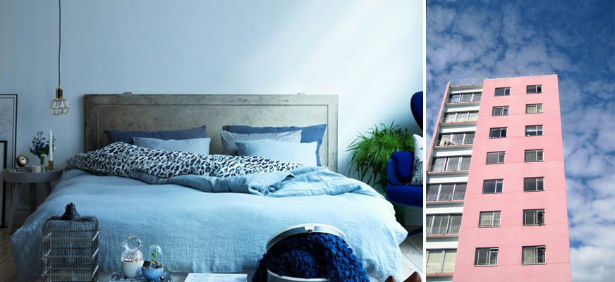
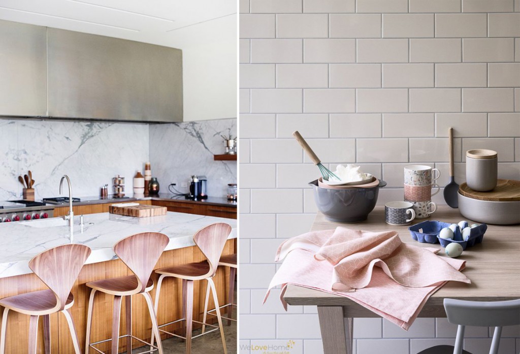
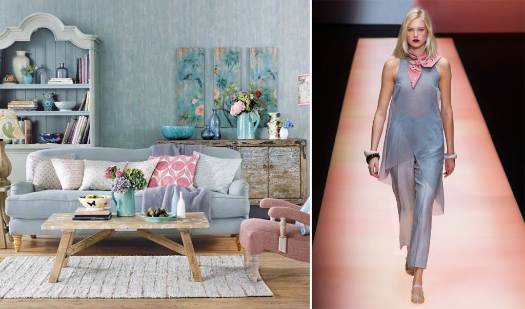
There is a first time for everything! Pantone just announced not one but two shades, Rose Quartz & Serenity, as the 2016 Color of the Year. This harmonious duo came as a happy surprise. It is not like anyone expected the pairing of two opposites, a warm dusty pink and a cool blue.
The inspiration came from the ever changing and chaotic times that we now live in; consumers seek harmony and mindfulness which can be found in color.
Rose Quartz (Pantone 13-1520) is a “persuasive yet gentle tone that conveys compassion and a sense of composure.”
Serenity (Pantone 15-3919) is “weightless and airy, like the expanse of the blue sky above us, bringing feelings of respite and relaxation even in turbulent times.”
Expect to see this harmonious duo across high fashion, home interiors, accessories and design throughout the year. Independently or coupled together, Rose Quarts & Serenity will bring a sense of calmness and relaxation to any home environment.

 2018 was definitely ultra violet. The provocative, thoughtful yet mysterious shade of purple led us straight into the calmness and comfort of Living Coral. Living Coral embraces us with warmth and nourishment to provide comfort and buoyancy in the Read More 2019 Motto: Living Coral